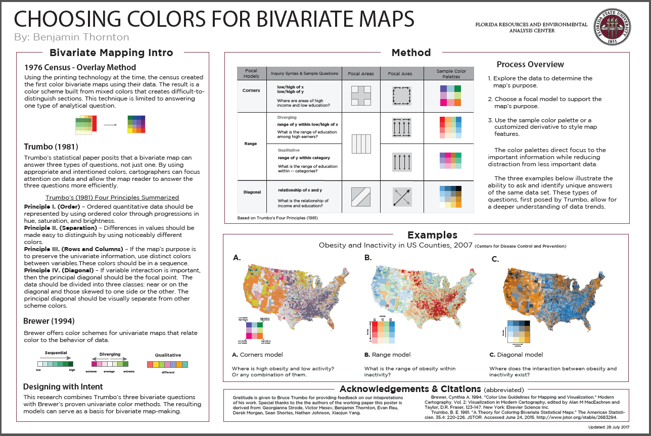
Bivariate maps show two pieces of data simultaneously.
The poster below explains and demonstrates color theory for bivariate maps. These colors work for both choropleth and gridded maps
to answer three types of questions.
Download Poster
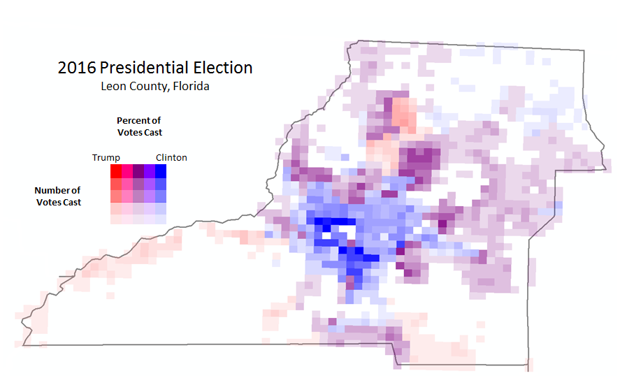
Election Map. This map uses the Range color method to display the percent and number of votes cast within a category.
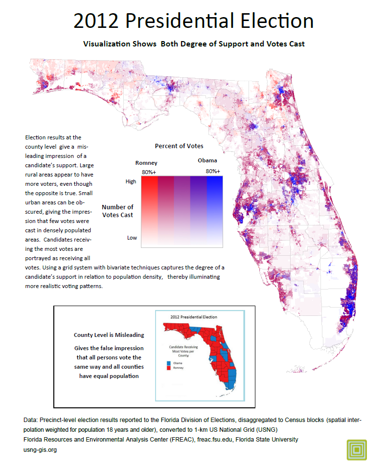
Election Map. Also uses the Range color method to display the percent while considering
the number of votes in an area.
Download Poster
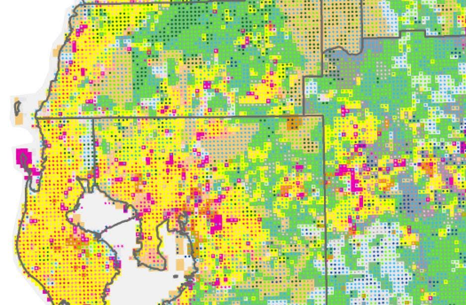
Land Use and Land Cover are used to convey information about a landscape. For this example, land use comes from the cadastral database, using the local land use code assigned by the property appraiser. The land cover data is from the National Land Cover Database.
The visualization technique uses nested symbology where land cover circles are placed within land use squares.
Details of the technique are explained in this Presentation.
Download Data
Download Poster
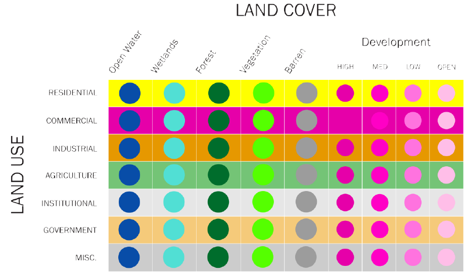
Relationships Between Land Use and Land Cover
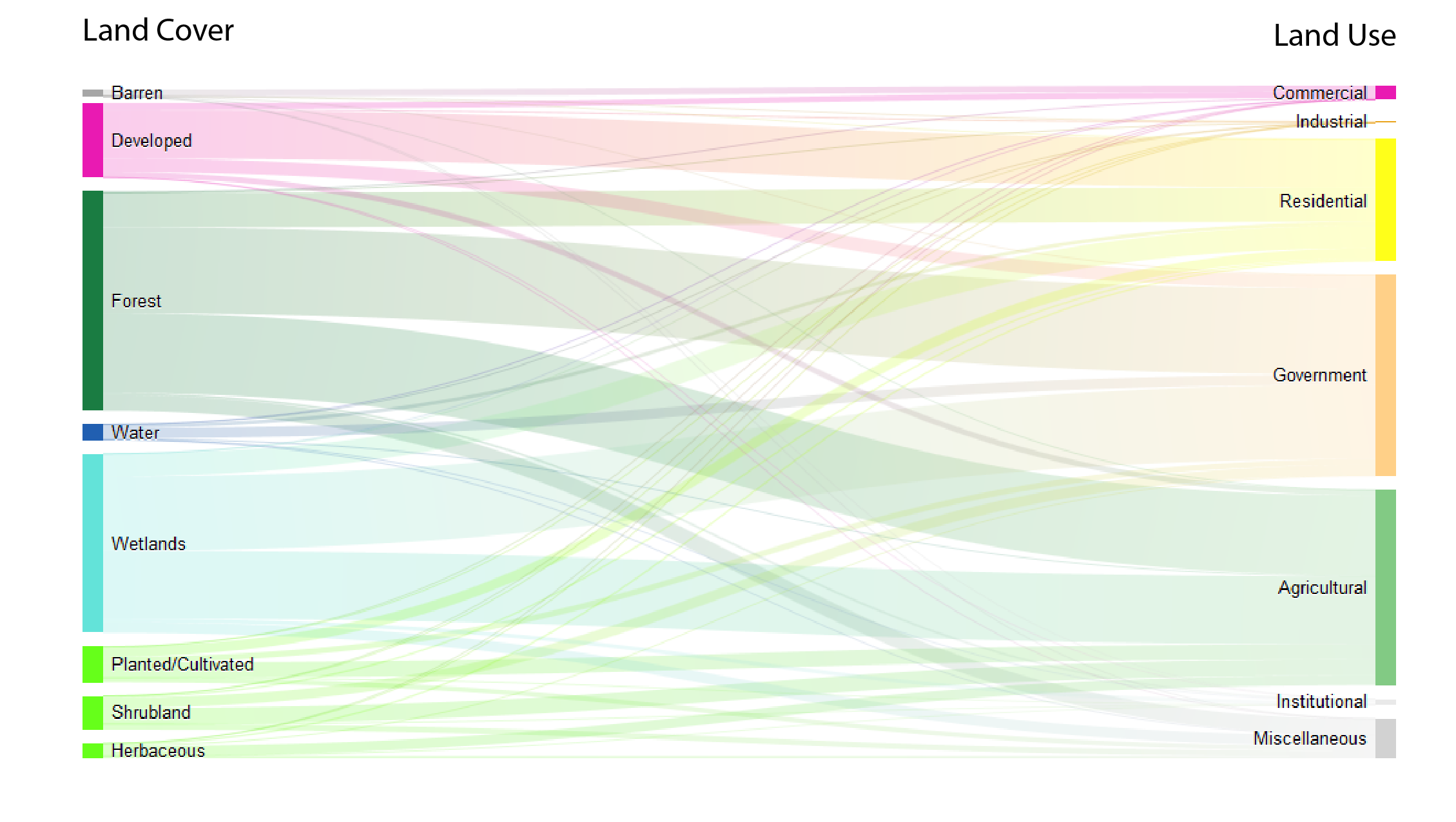
Sankey diagrams are a specific type of flow diagram where the width of the connecting lines is shown proportionally to the quantity. Sankeys are typically used to visualize energy or material transfers between processes. In this
case, the connecting lines show the relationships between land use and land cover.
State of Florida
Land Use and Land Cover are used to convey information about a landscape. For this example, land use comes from the cadastral database, using the local land use code assigned by the property appraiser. The land cover data is from the National Land Cover Database.
The visualization technique uses nested symbology where land cover circles are placed within land use squares. Details of the technique are explained in this Presentation.
Download Data
Download Poster
Relationships Between Land Use and Land Cover
Sankey diagrams are a specific type of flow diagram where the width of the connecting lines is shown proportionally to the quantity. Sankeys are typically used to visualize energy or material transfers between processes. In this case, the connecting lines show the relationships between land use and land cover.
